20 June 2024 — By London Museum
How we created the new London Museum brand
The process of creating a new brand for an established museum is full of opportunities and pitfalls. How do you reposition to appeal to new audiences while retaining your existing ones? How do you make your brand truly representative? Here’s our story…
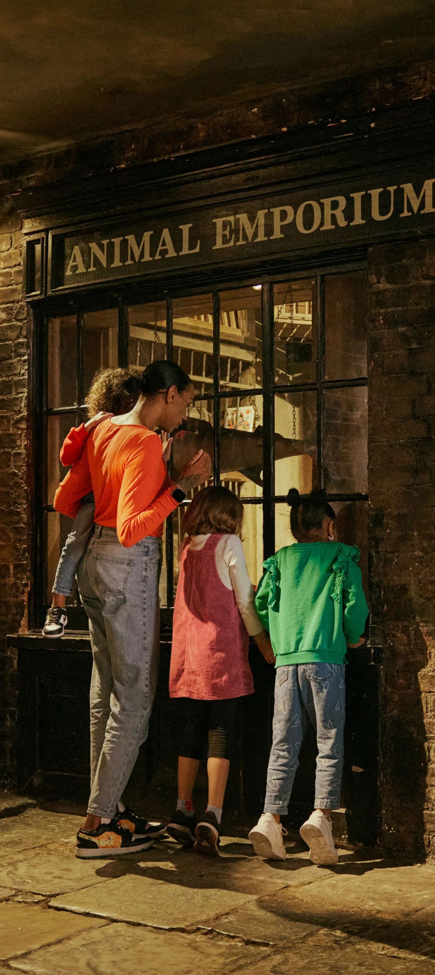
The museum is making a historic move to create a new home in Smithfield. This is a journey not just about tackling discreet doorways (the museum’s hard-to-find entrance at London Wall has always been a challenging feature of the site). It’s about making sure the museum continues to be engaging and relevant and to inspire people with stories about one of the world’s great capital cities.
As we set about imagining a new home in Smithfield and revitalising our site in Docklands, we decided to take a look at the museum’s brand: did it still resonate?
“The pigeon and splat speak to a historic place full of dualities, a place where the grit and the glitter have existed side by side for millennia”
Sharon Ament, Director of London Museum
Developing a framework
We turned to 500 Londoners and tourists to get their thoughts and to inspire us in focus groups, workshops and surveys. They affirmed that our founding principles, rooted in the 1965 Museum of London Act, remained relevant. We are here to enhance the understanding and appreciation of London and all its people - past, present, future.
Our approach needed evolution though. Londoners told us they wanted the museum to address big issues, be grounded in the realities of London life, and put on entertaining, thought-provoking programming. Working with agency partner Something More Near, this became our brand framework. Whether you encounter us in schools, online or on site, you will experience London stories crossing and colliding, showcasing the grit and glitter of this great city.
We heard two other critical insights: our old logo was unpopular, representing neither our identity nor aspirations. London Museum also felt like a clearer proposition. A confident statement about who we are and what we do. A name anchored within the museum’s history, having been originally formed by a merger between the London Museum and Guildhall Museum back in 1976.
-

Londoners taking part in a Book of Boroughs brand workshop.
-

A visual from the brand workshops back in 2020.
Collaborating with Londoners
"To translate London Museum’s brand framework into a visual identity we looked for the best of London’s creative talent. People who shared our passion for involving Londoners in the process" reflected Andrew Marcus, former Chief Communications & Digital Officer “and that’s how we found Uncommon Creative Studio.”
London Museum is a shared place in the middle of it all. To bring this ethos to life, Uncommon recruited 33 Londoners, from the 32 boroughs and the City, who have made their mark on London. The group ranged from tattoo artists to DJs, chefs to children’s TV producers, boxers to museum conservators.
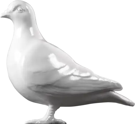
Inspired by the 33 Londoners, Uncommon added some of their own magic and from there the pigeon and its poop was born, becoming a symbol of London’s dualities.
The birth of an icon
Historically, creatures have been used to symbolise brands, organisations and places. Lloyds Bank projects strength with a black horse. HMV’s dog listens attentively. Dragons protect the City of London. Now, London Museum will have a pigeon: an impartial and humble observer of London life.
For hundreds of years pigeons have witnessed life in the city and they are featured in the museum’s collection, from Roman figurines to Victorian Valentine’s cards. You can read more in our blog about the history and significance of pigeons.
"A good logo gets people talking. Our pigeon, cast from London clay, and its splat, rendered in glitter, prompts people to reconsider London. The pigeon and splat speak to a historic place full of dualities, a place where the grit and the glitter have existed side by side for millennia. We share our city with others, including millions of animals. Pigeons are all over London and so are we,” explains Sharon Ament
“London Museum’s new brand is characterful and distinctive, and communicates something important about London”
Josh Green, Head of Design
Nils Leonard, co-founder at Uncommon Creative Studio said, "We wanted more than a new identity for this amazing museum, we wanted to find a new icon for London itself. Something honest, something remarkable.
After extensive research the answer had been strutting around in front of us the whole time. You can find it in the grit and the glitter, proud in every borough, and now immortalised in this identity.
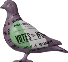
We wanted the pigeon to also become a reflection of the diversity and constantly changing beauty of the city. So we designed it as a blank canvas that could mirror the influences, identities, ideas or events shaping London.
We then created a new body language for the museum, a scrawled typographic approach and a bold new icon."
London Museum’s new look
A key feature of the museum’s new visual identity is the use of fonts. Print and script are juxtaposed to suggest duality. The primary sans serif font is inspired by a 19th century typeface from Caslon Foundry in Islington, contrasting and connecting with hand drawn flourishes and text.
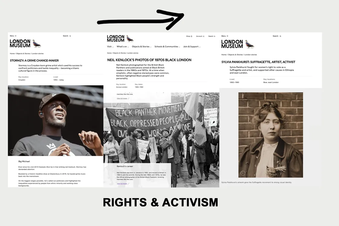
Historic and contemporary images of London are also presented unedited to depict the reality of London, then and now. These pictures are carefully curated, often drawn from our extensive collection. Accessible design means the brand is legible wherever it is encountered.
"London Museum’s new brand is characterful and distinctive, and communicates something important about London. Over time people will come to recognise the pigeon and splat as signifiers of London Museum and everything it stands for," said Josh Green, Head of Design, London Museum.

The pigeon and splat are part of a comprehensive graphic system.
Our rebranding to London Museum signals a moment of change for the museum; one which honours the past and ushers in the future.
Tags
-
 Nature & Environment
London pigeons: A bird's eye view of history
Love them or hate them, pigeons have been part of London for over 1,000 years
-
 News
NewsIntroducing our new website
We’ve got everything from Harry Kane to the Sex Pistols and the Great Fire to the Empire Windrush
-

-